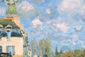
Lighting is an essential part of how art is presented. The color temperature, brightness, and direction of light can influence how viewers perceive an artwork's colors, details, texture, and atmosphere.
Carefully planned illumination helps artworks remain clear and visually balanced while supporting their proper display and preservation.
Understanding Warm and Cool Illumination
Color temperature describes the warm or cool appearance of a light source and is expressed in Kelvin (K). Lower values generally produce warmer-looking illumination, while higher values create cooler-looking illumination.
Warm illumination has a more yellow or amber appearance, while cool illumination tends to look more neutral or blue. The appropriate choice depends on the artwork, its colors, materials, and exhibition environment.
How Light Influences Color
Light plays a fundamental role in how color is perceived. Different light sources contain different distributions of wavelengths, which can cause the same artwork to appear somewhat different under varying illumination.
Color rendering is therefore an important consideration in gallery lighting. A light source with good color-rendering characteristics can help viewers distinguish the relationships between hues more accurately, particularly in works containing subtle tonal changes or closely related colors.
Revealing Surface and Detail
Lighting also influences how viewers perceive an artwork's surface.
Paintings can contain variations in texture, layered pigments, glossy areas, and other physical characteristics. The direction, angle, and distribution of illumination can make certain features more noticeable while leaving others visually subtle.
Even illumination can provide a clear overall view, while carefully positioned directional lighting can highlight selected surface qualities. Balanced placement is important because excessive reflections or uneven brightness can interfere with comfortable viewing.
Creating a Cohesive Exhibition
Lighting decisions extend beyond individual artworks. An exhibition benefits from a visual environment in which each work can be appreciated within its surroundings.
Wall color, spacing, neighboring artworks, architectural features, and ambient illumination can all influence perception. A carefully planned lighting arrangement creates a balanced relationship between the artworks and the gallery environment.
The goal is for lighting to support the exhibition without becoming the main focus.
Balancing Display and Preservation
Visibility must also be considered alongside conservation. Light exposure can contribute to changes in sensitive materials over time, with the potential impact depending on factors such as illumination level, exposure duration, and material sensitivity.
Paper, textiles, photographs, and certain pigments may require particularly careful control. Galleries can adjust illumination levels or exposure periods according to the needs of individual works.
This approach provides suitable visibility while helping limit unnecessary light exposure and supporting the long-term care of collections.
The Role of Lighting in Art Appreciation
A well-designed lighting environment allows viewers to examine artworks comfortably and appreciate their visual qualities without distracting reflections or excessive contrasts.
Color temperature can influence the perceived warmth or coolness of a composition, while color rendering affects how clearly its hues are represented. Brightness and light direction further shape the visibility of surfaces and details.
Together, these elements establish the visual conditions in which an artwork can be appreciated.
Gallery lighting is an essential component of professional art presentation. Color temperature, color rendering, brightness, direction, and exposure all contribute to the way artworks are viewed.
Effective lighting brings these elements into balance, supporting clear color perception, visible detail, a cohesive exhibition environment, and responsible preservation. When thoughtfully planned, illumination remains subtle while allowing the artwork to stay at the center of the viewing experience.