Ever noticed how a single bouquet can lift your mood or set the scene for a whole event? That’s the quiet power of color in floral design. From bold reds that whisper passion to soft blues that calm the soul, color isn't just decoration—it's emotion, intention, and storytelling wrapped in petals.
Whether you're crafting a joyful wedding bouquet or a tranquil table arrangement, the right color pairings can transform your floral creation into something deeply expressive. In this article, we’ll dive into how flower color combinations speak volumes—shaping moods, themes, and unforgettable moments.
Choosing Flower Colors for Different Emotions
Have you ever noticed how certain colors can instantly change how you feel? The same goes for floral designs. The color of flowers has the power to convey various emotions, from joy and excitement to calm and serenity. Let's dive into how we can choose colors based on the feelings we want to evoke.
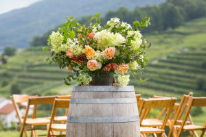
For example, bright, warm colors like yellow, orange, and red are commonly associated with joy, energy, and warmth. These colors are perfect for celebrating happy occasions like birthdays, anniversaries, or any event that calls for a lively atmosphere. Yellow, in particular, is known for representing happiness and optimism, while red is often linked with love and passion.
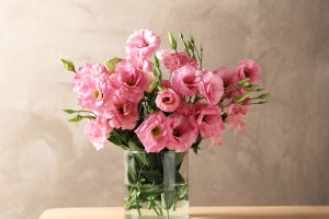
On the other hand, cooler tones like blue, purple, and soft pinks can create a sense of calmness and tranquility. These colors are ideal for settings that aim to relax and soothe, such as in a spa or for a memorial service. Blue, in particular, evokes a sense of serenity, while soft pinks can add a gentle, peaceful touch to any arrangement.
For more formal or solemn events, deeper shades like burgundy, navy, and ivory convey elegance and respect. These colors add a sense of sophistication and dignity, making them a great choice for weddings, corporate events, or memorial arrangements.
Creating Harmony Through Color Pairings
Now that we understand how individual colors can evoke specific emotions, the next step is to pair them thoughtfully. In floral design, balancing color combinations is key to creating an aesthetically pleasing and emotionally resonant display. So, how do we achieve harmony?
One way to ensure harmony is through analogous color schemes. These are colors that sit next to each other on the color wheel, such as blue and green or red and orange. When used together, they create a smooth and unified look that feels calming and natural. For example, pairing soft pink with lavender creates a gentle, romantic vibe that works well for weddings or intimate gatherings.
Another approach is using complementary colors, which are opposite each other on the color wheel. Colors like purple and yellow or red and green create a bold contrast and make each other stand out. While this approach can feel more dramatic, it's also highly effective for creating eye-catching designs that demand attention.
If you want to create a design that feels fresh and vibrant, consider using triadic color schemes. This approach uses three colors that are equally spaced apart on the color wheel. For instance, using blue, yellow, and red together can create a playful and energetic design. However, balance is key here, so it's important to use one color as the dominant hue and the others as accents.
Contrasting Colors for Impact
While harmony is important, contrast is equally powerful in floral design. By juxtaposing contrasting colors, we can add visual interest and drama to a floral arrangement. Contrast doesn't have to be extreme—it could simply involve combining different shades of the same color, like deep purple with lavender, to create depth and texture. The subtle difference between these shades adds richness and intrigue to the design.
In situations where you want to make a bold statement, high contrast color pairings can draw attention and create a dynamic atmosphere. For example, pairing vibrant orange flowers with dark blue creates an eye-popping contrast that adds energy and excitement to any space. Similarly, combining rich red with soft green creates a striking contrast that feels both festive and sophisticated.
Conclusion: Color as a Storyteller in Floral Design
In conclusion, color plays an essential role in floral design, shaping not only the aesthetic appeal but also the emotional impact of the arrangement. By carefully selecting flower colors based on the emotions and themes we want to express, we can create designs that resonate with people on a deeper level. Whether we are designing for a joyous celebration or a peaceful memorial, the colors we choose can elevate the experience and set the tone for the occasion.
We hope this article has inspired you to think more deeply about the role of color in your floral arrangements. Whether you're a beginner or an experienced florist, remember that each color has a story to tell. Happy designing, and may your flower designs always convey the emotions and themes you wish to express!